- January 31, 2019
- Posted by: admin
- Categories:
Xamarin.Forms 4.0 release comes with the two new features which is collection view and carousel view .
The CollectionView is intended to be a successor to the ListView, improving upon its design by reducing technical complexity and allowing for more flexibility of layout and function.
Before using any of these features you need to update an existing project to the Xamarin.Forms 4.0-pre NuGet (available via your favorite NuGet package manager using the pre-release option).
Since this has been just available for experimental purpose so you have to enable the CollectionView (which also enables the CarouselView) with a feature flag just before you initialize Xamarin.Forms in your MainActivity.cs and AppDelegate
“global::Xamarin.Forms.Forms.SetFlags(“CollectionView_Experimental”);” 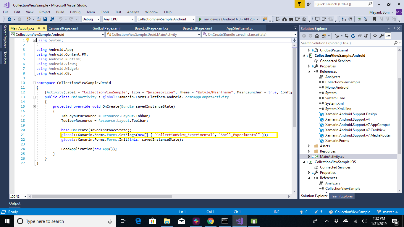
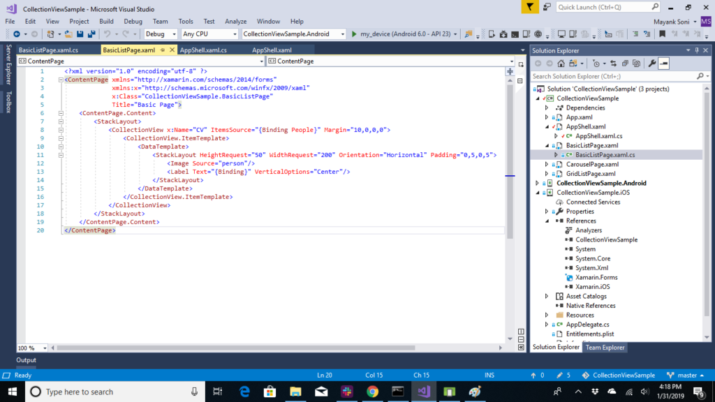
One of the biggest changes between ListView and CollectionView is the removal of wrapping content in a ViewCell. This allows for significant gains to performance, especially on Android, while remaining familiar to what you’ve done before when using the ListView. Lets us first implement the basic layout.
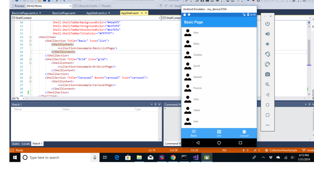
Our landing page here is AppShell.xaml, in this we have used shell to use bottom navigation.
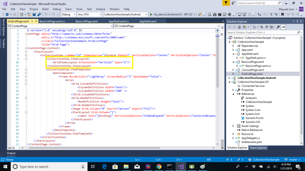
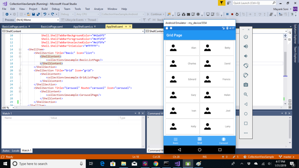
Making A Grid Layout
By default, CollectionView assumes a linear layout. That means you can not only do vertical lists, but horizontal as well! This is accomplished by setting the ItemsLayout property to a new instance of ListItemsLayout which takes an ItemsLayoutOrientation parameter (Vertical|Horizontal).There’s also another option available: the GridItemsLayout. Using a GridItemsLayout, you still get a scrollable list, but now with two items in each row:
CarouselView : You can use CarouselView, a separate control which uses CollectionView as its basis, can be used to adjust your layout, and add in some business card-like information
One of the great features provided by CollectionView is the ability to add snap points. For the page you just designed, it allows for the view to stop part-way between cards. What if you instead want only one card to appear centered at a time? With the SnapPointsAlignment and SnapPointsType properties on the ItemsLayout, you can configure this behavior in a snap (pun intended)! Add the following to your XAML for enabling this behavior:
At this time, the controls are still in a preview state, and as such are missing features and feature parity.
Collectionview is available for both iOS and Android and carousel view is available only for android.
For the complete visit “https://github.com/mayanksoni94/CollectionViewSample“